Clearer rendering choices, tidier controls
Compare rendering styles at a glance and enjoy cleaner account controls on desktop and mobile.
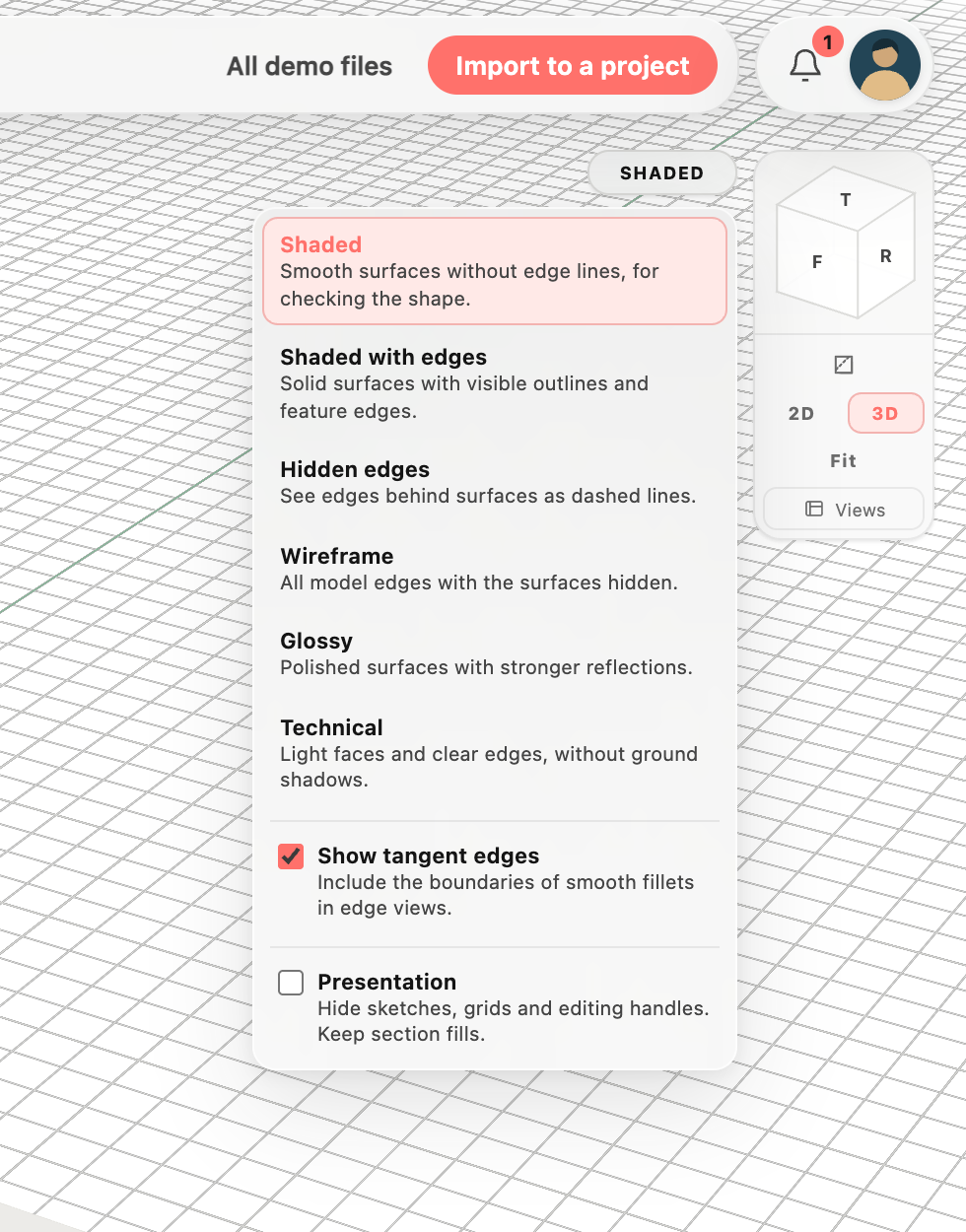
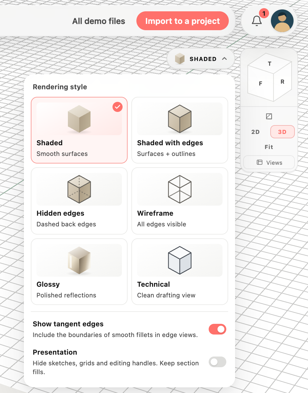
See each style before choosing
 BeforeAfter
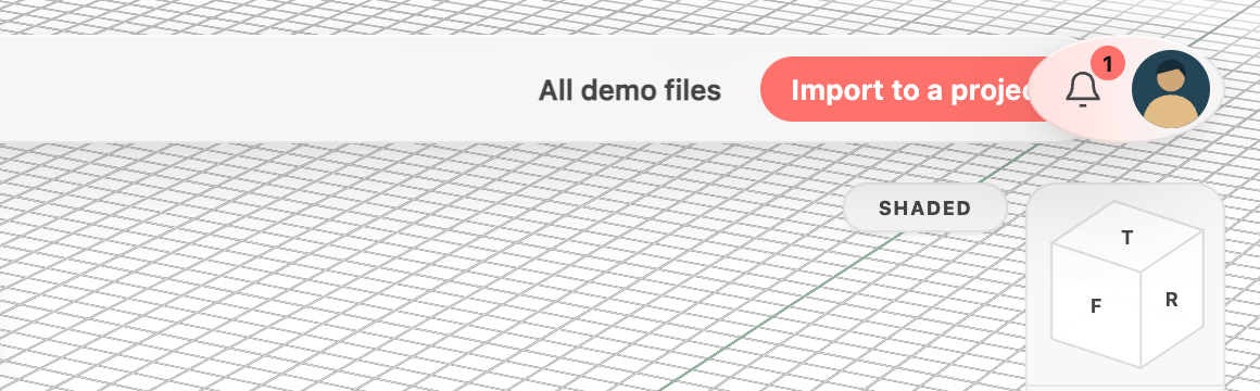
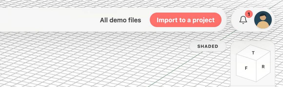
A tidy corner for your account and updates
 BeforeAfter
Everything in this release
Improved
- Rendering options now show preview icons for Shaded, Shaded with edges, Hidden edges, Wireframe, Glossy and Technical, including the current style on the button.
- Compare rendering styles side by side in a compact gallery, with larger previews, a selected-style checkmark and grouped display switches.
- On phones, a compact rendering preview sits beside your account, keeping the style picker clear of the feature tree and its menu easy to read.
Fixed
- The account photo and update bell now share a clean pill-shaped background instead of a stretched oval.
- Demo actions stay clear of the account and notification controls on desktop and phone screens.
- Account photos now have a subtle shadow that separates them from the surrounding controls.
